Do I have a special treat for you, my dear readers! 🙂
When the March-April 2013 issue of Veranda arrived, I was blown away. Yes, indeed! I’m referring to that drop-dead gorgeous cover and divine spread on designer Frank Babb Randolph’s home in Georgetown, DC. I must have read the article 3 times and studied the photos all week.
Frank and I met almost 10 years ago when he visited our first shop after reading about it in the Washington Post. Of course I knew who he was. As a longtime admirer of his work and inimitable style, I remember being very nervous – the equivalent of, say, a fashion graduate meeting someone like Anna Wintour of Vogue! (BTW, did you know Anna loves Swedish painted antiques? Google her homes. You will see.) Well, Frank couldn’t have been nicer and more charming. Today he is a dear friend and a true supporter of our shop. Thank you, Frank, for everything!
I recently visited Frank at his home, and asked if I could share a few photos of his stunning abode. And, I asked if he would share a few design tips from his 45-year career in the industry. Shall we take a guided tour?
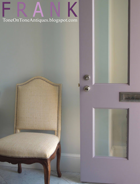
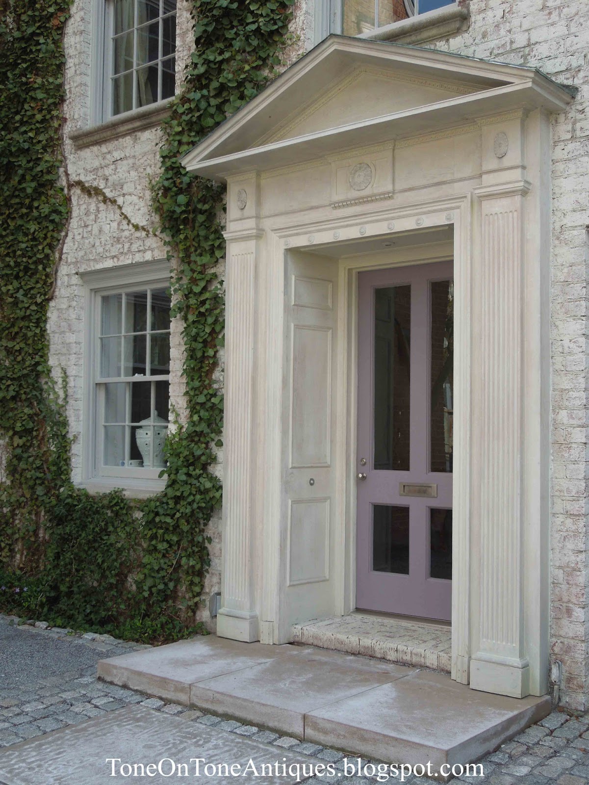
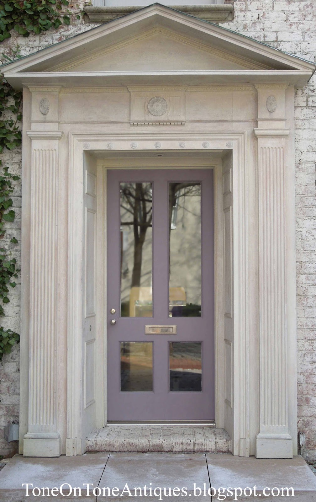
Though built in the 1950s, the house looks nothing like a mid century home. That’s because Frank dramatically changed much of the architecture since moving in 17 years ago. The latest change is the front courtyard now clad in Belgian block, gravel and thick limestone. And also, the newly painted front door in Farrow and Ball’s Brassica.
The stately door surround was added by Frank. His love of classical architecture inspired this handsome masterpiece.
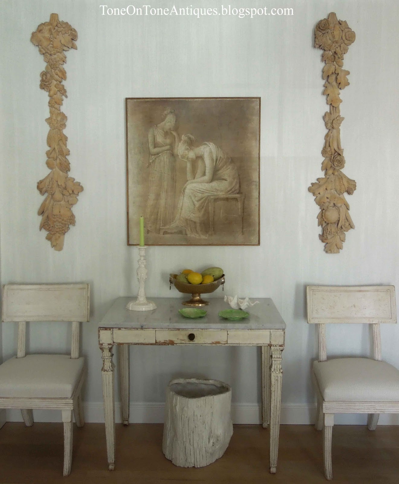
Above is a vignette from the foyer. The modern painting is by artist Tom Nakashima (nephew of George Nakashima).
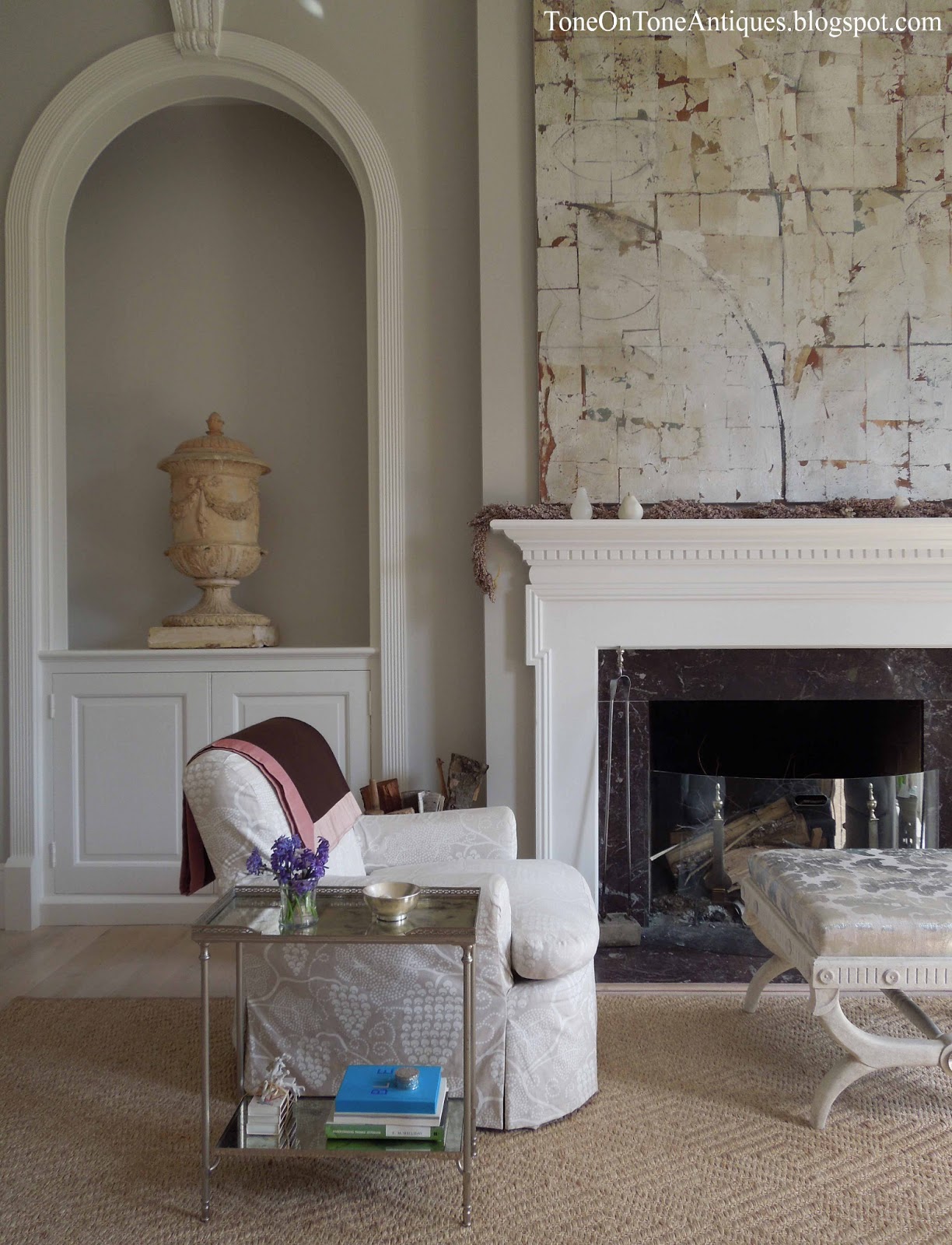
Going up a few steps, you come into the grand drawing room located on the backside. The room overlooks a private courtyard – so Georgetown! The oversize silver leaf and acrylic abstract painting by Annapolis artist, Elizabeth Dax, adds even more drama, especially during cocktail hours when the room is illuminated by candlelight.
Draping one of the club chairs is a cashmere blanket edged in Chinese silk. The pair of French side tables, in the classical style, are from the early 20th century.
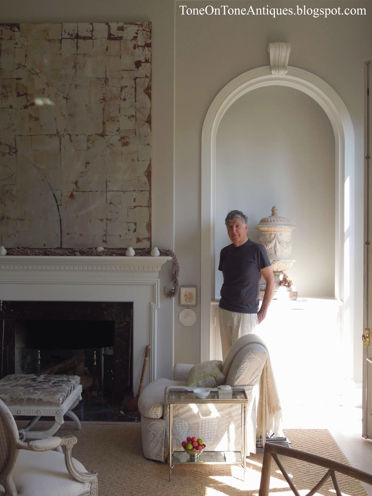
Hello, there! I asked Frank, who is over 6 feet tall, to stand in front of the niche to show the scale of the 13′ ceiling.
One of the covered urns with beaded rim, draped laurel swags and pine cone finial.
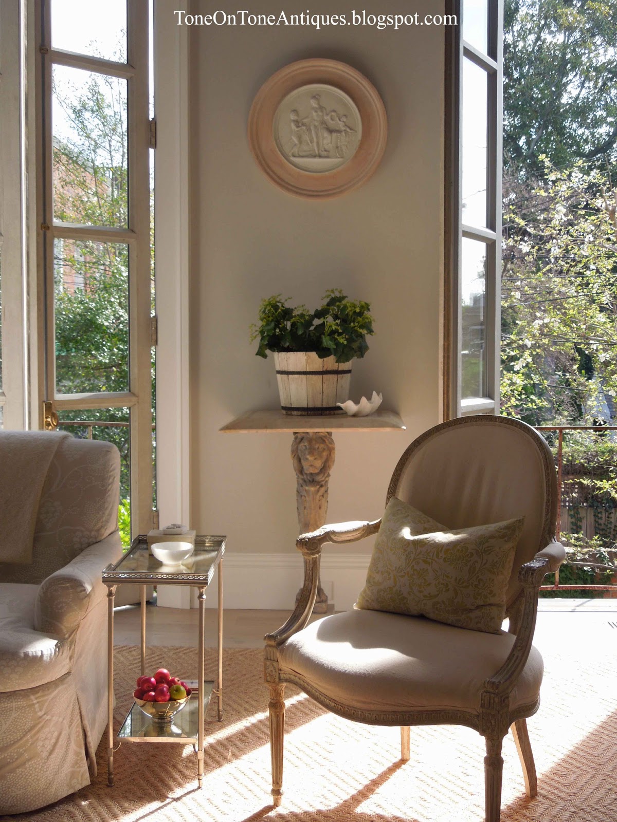
Three sets of tall French doors flood the drawing room with sunshine. The bisqueware plaque of “Spring” is by Royal Copenhagen. The 19th century painted sap bucket is from Vermont.
Frank designed the monumental pier mirror and console table. The red lacquered dowry trunk is Japanese. On the console is an early 19th century French faience brasero, which was originally a portable heater most likely from a chateau. Frank and I both love and collect brasseros in white faience.
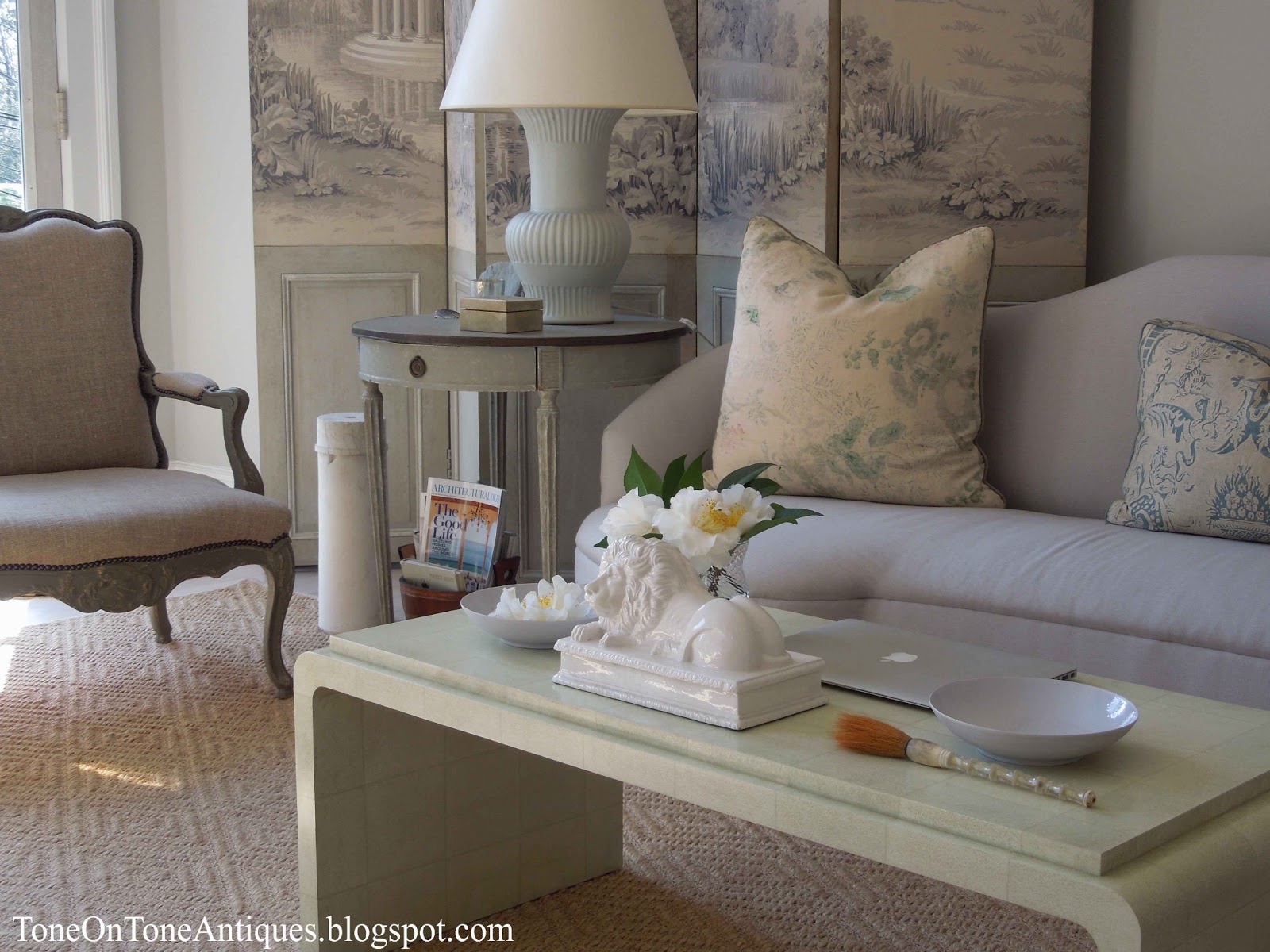
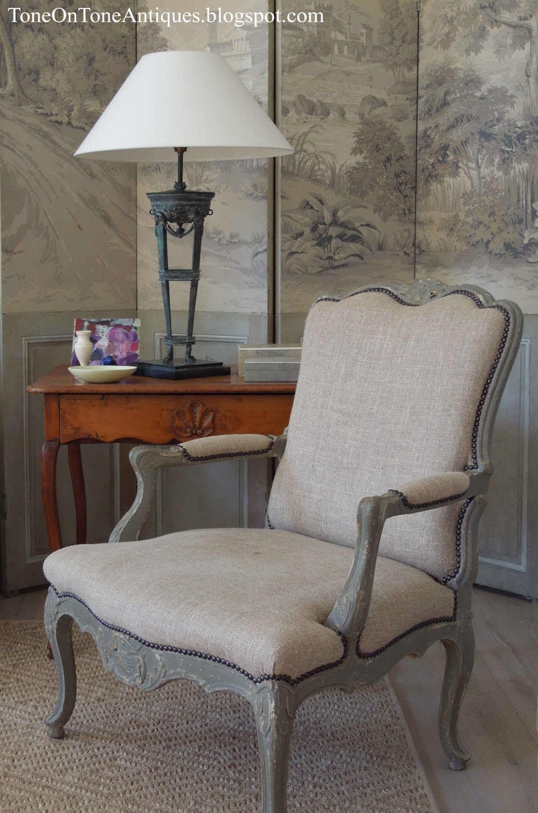
On the other side of the living room opposite the fireplace is this chic sitting group. Flanking the sofa is a pair of Zuber grisaille screens. The painted armchairs are from
Tone on Tone.
Below is a portrait of Frank at age 29 (charcoal and pastel, London).
Directly above the foyer is the dining room, which faces the street. Notice the recently faux painted walls by
Lenore Winters. Lenore is an amazing faux painter / artist, and her studio is right around the corner from my shop. For the dining room, Frank and Lenore chose a sublime hand-combed striated pattern.
I love this photo! Though simple, it reminds me of the pared down Gustavian interiors of 18th century Sweden. The chartreuse taffeta silk curtains are unlined for movement at the slightest breeze. And, the leading edges are deliberately frayed – a signature Frank Randolph detail! Silk is from
Taffard.
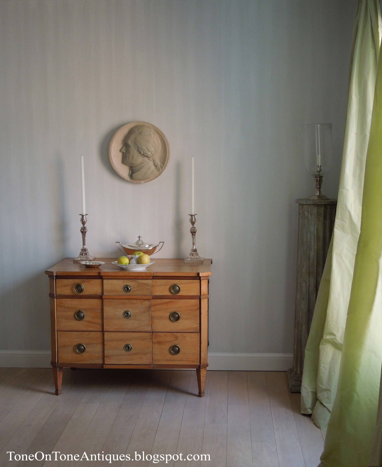
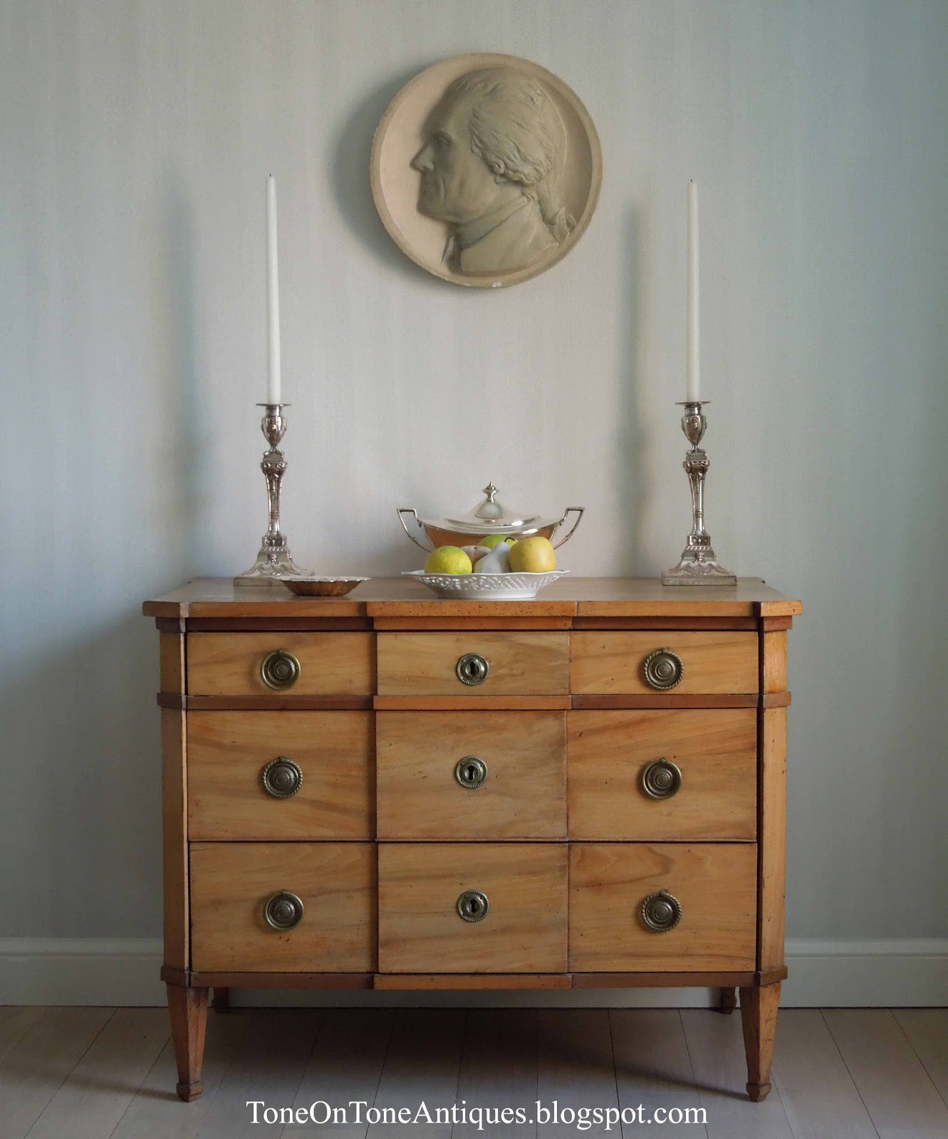
Above the Swedish blonde wood commode is a French plaster plaque of Thomas Jefferson. The dining room is only illuminated by candlelight hence all the candles. Frank is not a fan of chandeliers or hanging fixtures. Why? “It brings the ceilings down!”
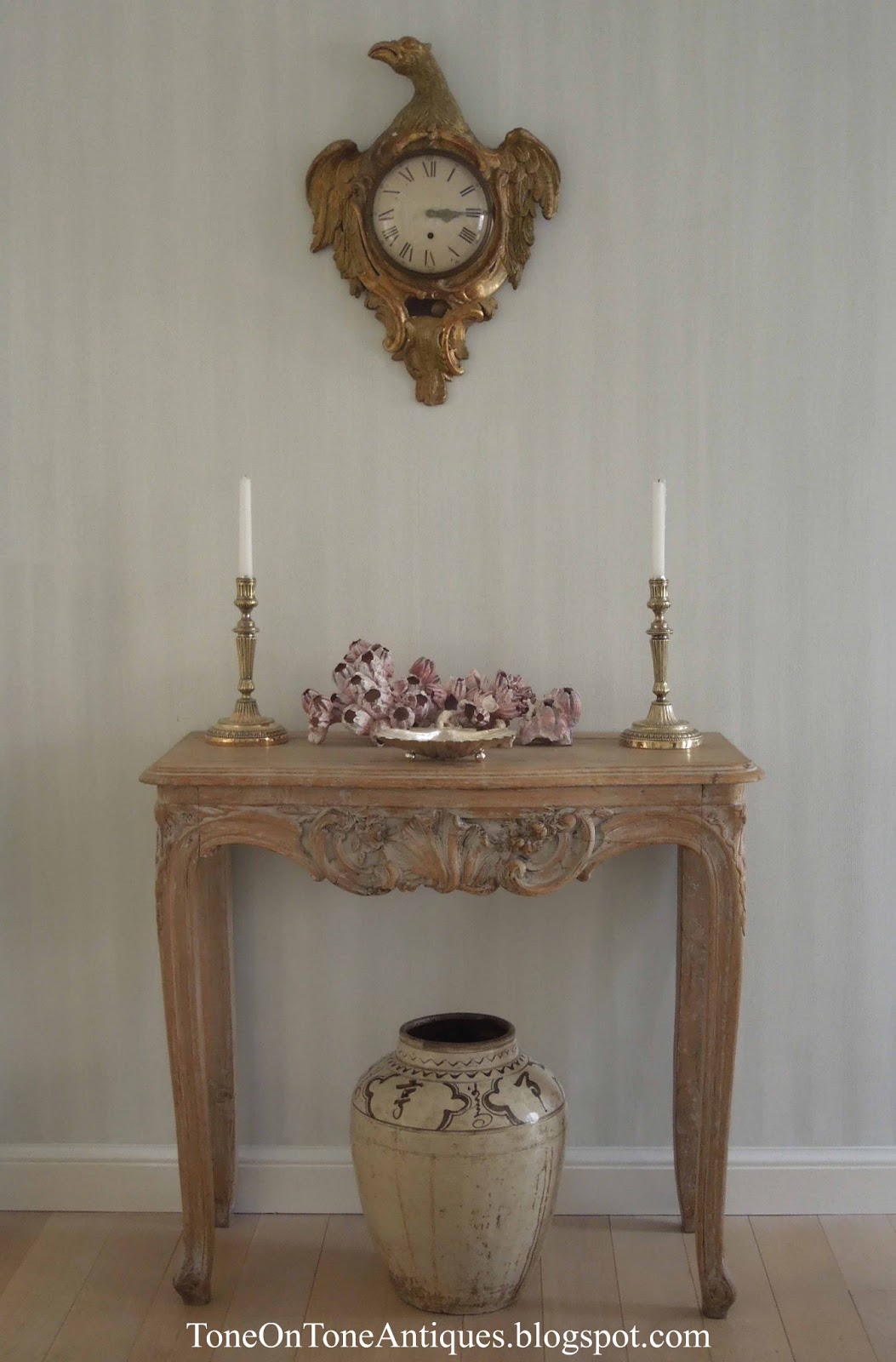
Frank found this French bleached wood console table at our shop. The pot is Chinese and the cartel clock is most likely Swedish.
One last look: a contemporary painting by
Cory Daniels (Maine) in an antique lemon-gold gilt frame.
After the tour, we sat down for a chat. So, Frank, we all love your style, and want it!! Can you please share 3 ways for us to get your look? 🙂
1) Start with a neutral color, and build from there.
2) Pick an accent color that inspires you.
3) Don’t be afraid to mix classical antiques with contemporary art.
Thank you, Frank, for everything – the tour, your sources and design tips! –Loi


What wonderful friends you have! 🙂 Frank's home is stunning, and I love how he pairs more formal pieces with utilitarian items (like the sap bucket) to make the home less intimidating. The contemporary art is all amazing…well the whole thing is actually. Thanks for this insider's peek Loi!
xo Kat
Thank you, thank you, thank you! This post is the highlight of my day! The covered urns are incredible. The chartreuse silk taffeta curtains made my heart beat faster. I absolutely love everything about Frank's home and his style – he is the designer I would hire if I ever won the lottery.
A treat indeed. I am very taken with the refined "edited" style, and the embellishmemts to the exterior of the house, particuluarly the front door are stunning.
This may be remembered as one of the great design posts of 2013. The pictures are beautiful and your commentary is so interesting and informative. Great late night reading!
Dear Loi,
I am enjoying reading this post while having breakfast before buzzing off to work.
Lighting the entire room solely by candlelight? That is something I love!
I do like the curtains too and the idea that they are light thus picking up the slightest breeze, is very appealing.
Given its large proportions, I wonder what form of heating that living room has?
Bye for now
Kirk
x
Good question, Kirk. The room gets a ton of warm sunshine all year round. During the winter months, Frank uses the fireplace in addition to the heating system. Thanks!
My favorite designer. His look is timeless. What a fun visit you had. Thanks for sharing. I also enjoyed the additional pictures.
Karen
Absolutely beautiful and elegant, Loi! So fun to see more of Frank's work. I had noticed the chair from your shop in the Veranda piece. Going back to reread slowly now as I do with most of your posts! Love your descriptions and every single image. The lilac door is divine and the artwork is all fantastic. Well done… both of you!
Thank you, Cindy, for noticing our chair in the magazine. Tom and I were so pleased. Cheers!
Of all Randolph's impressive and beautiful things, what I most envy at this moment is those glimpses of views outside his windows. Oh, and that Jefferson medallion!
–Road to Parnassus
Hi Loi – Such a treat! Thank you to you and Mr. Randolph for the tour. Everything is beautiful and the touches that stood out (to me) were he lavendar front door, pillows on the sofa and the colorful accents in is living room. I love the chartreuse drapes too and it's interesting that they are unlined. It's all lovely.
-Deborah
Eek. Sorry for the typos above! It was early morning and I should have been wearing my glasses while typing!
No worries, Deborah 🙂 Thank you for the kind words. We really apprecaite it!
Ooops, sorry for my typo! s/b appreciate 🙂
Dearest Loi….
Every time I come to your blog, I swear, I have to control myself! My heart starts to beat quickly, my eyes jump around from every which way, and then I get so inspired that I can hardly contain my excitement, and I'm telling you the TRUTH!
THis is a masterpiece. I love that you asked Frank to give us some tips, and you tell that man (teeheee) a BIG HUGE MERCI for sharing his secrets. I totally agree with starting with the neutrals (they never, ever fail) then not being afraid to add an accent color. Then only through blogging have I even come to appreciate modern or contemporary with classic. TOO MUCH of any style together becomes monotonous, and unless we can pinpoint the "problem", it is so bothersome. But peace, ease, elegant living is always found at TONE ON TONE, and with your guests.
I have so much I want to do to this house still and I'll let you in on a secret; if I had my druthers, I would paint the exterior of our house WHITE, as I see that Frank's home is painted brick. Our home was built in 1951, and the brick used is a ubiquitous product used back then called CHICAGO BRICK. It is lovely, but we wouldn't ruin any special vintage product by painting it. But my beloved husband may squawk about it!
HUGS AND LOVE, Anita
WOW! what a stunning home! i love that it's beautiful and relaxing…. not overdone and the palette is consistent. and i love mixed styles and genres, too! thanks for taking us inside frank's home!
Well Loi, you've done it again, I'm drooling uncontrollably!
This is exquisite. Almost an exquisite simplicity as nothing is overdone. A mistake so many make in decorating. Following you has made me tire of living on a boat. There's not much decorating I can do other than soft furnishings. That, and having spent a week in a French country cottage I would love to get my hands on, have made me think hard about buying a land based property. I feel an adventure coming on.
I thanks you for your inspiration and friendship.
Much love.
Di
XXXXX
What a thrill, Loi – this tour is better than Veranda's! Your photos really give a sense of the dramatic proportions of the rooms and I love the details you have focused on. Also, I am fascinated by the color of the front door – it seems quite modern in its classical setting – fabulous!
xo,
Phyllis
Such a beautiful and gracious home, Loi with so many lovely pieces. I appreciate that each one has been carefully selected for just the right spot. My favorite is the Swedish blond wood commode although everything is exquisite.
Best,
Mimi
years ago when my sister lived in Georgetown, I would go on long walks while visiting….straining to see inside windows of the beautiful homes. Thanks for taking me inside….this one better than my imagination. I too loved that piece in Veranda…thank you for the additional views and details. Dreaming of dining by candlelight now
LOVED his house on the Georgetown house tour -MUCH better than the photographs in Veranda even! Full of surprises – loved the little peak down the stairs to the family room too off the garden!
PS – Bob's new house in Georgetown is getting a purple front door after seeing Franks on the Georgetown house tour – our inspiration!
I can't wait to see Bob's new place!! His old home was fabulous!
oh my dear god- this was wonderful. so much better than the magazine's staticness! i loved this Loi!
Gorgeous home Loi and Frank is indeed a great designer.
Loved his accentuation of the ceiling heights, all of his decor and finally his 3 tips!
2013 Designers Series
xoxo
Karena
Art by Karena
OH My Goodness! That piece in Veranda has been one of my favorites ever! To think …."I "know" (WELL NOT REALLY) some secrets where and who some of the priceless pieces are from" WOW!
Your photos and added information gave such an intimate feel to this beautiful home!
Thank you Loi for sharing your talents with us!!!!
Wow, Loi, what a treat to see this gorgeous home from your perspective. I too, remember studying every image in Veranda, and the lavender door…fabulous!!
Loi, Yes, we all want it! Just fabulous. So nice of him to do the interview with you.
Hi Loi, What impeccable taste and gorgeous tonal style! The tips at the end of this post actually make it sound easy (not!)……..thank you for sharing these gorgeous rooms!
Holly
I couldn't think of anything more appropriate then to echo all of the WOWS!
Thank you for sharing your experience and perspectives, they never disappoint….Frank Randolph's home is spectacular. A great place to showcase art.
Best,
Valerie
and now i shall study these gorgeous photos you have captured and let the lovely soak in. so much to admire in frank's house, loi. the quiet tones and texture get my heart pumping. thank you so much for sharing this amazing abode.
smiles to you.
michele
Loi,
This is such a treat! I adore his work and his home is so beautiful! Simply stated perfection. Love the frayed silk drapes, and his art, candlelit rooms, beautiful pieces. Thank you for sharing that, and I knew with a lavender front door it was going to be spectacular! So happy to see your pieces in there! You are in his league, and don't forget it!
xo Nancy
Powellbrowerhome.com
Loi, beautiful tour, I can see why you admire him so much and why he supports your lovely shop, you two are a perfect match!!
Kathysue
Stunning home, Loi. So glad you were able to share some of it with us.
Loi,
For me personally, this issue of Veranda was one of the best in a long while. This behind the scenes tour was icing. What a beautiful home. I love the architectural details, but there are some pieces of furniture I that have me swooning. Thank you for asking your friend to share his home with us. I also liked his advice, simple but true.
xo,
Karen
How beautiful! His palette is gorgeous, restrained with the most delicate, unusual color. those drapes, love!!
His house is beautiful. Thank you for sharing all of these great pictures and details!
xoxo Fletcher
Lovely home – I love neutral so I would love to relax in that house!
This post is the treat you promised. Thank you for beautifully expanding on the Veranda article. The front door color is just lovely (what an eye to have selected that color for that spot!), and what's behind the door does not disappoint!
My favorite piece is the painted chair from your shop – such an elegant confection of tones!
Suzanne
The first thing that attracted me to Frank's work was his pairing of antiques with contemporary art. It doesn't always work but he seems to execute it beautifully. There are some really wonderful pieces in his home and I'm pleasantly surprised to see a Corey Daniels' piece. I'm a big fan of his gallery and work and I'm long overdue in blogging about him.
Many thanks to you and Frank for giving us this inside look!
Oh gosh, I'm drooling! You had me from the front door! What a beauty! The architectural details are tdf! The choices in furniture pieces and their placement are spot on! Frank is quite handsome too!:-). Lovely, lovely tour! Thanks for sharing Loi. X
Yes, Frank is handsome 🙂 Even more so in person!!
Timeless, neoclassical, gorgeous antique pieces and art–what more could anyone want! And besides, he the master of tonal variations.
having trouble posting, so this is just a test.
okay… guess the server had gas or something. What i wrote that got erased was…
…and twelve-foot ceilings and giga gorgeous architectural details. you had me at the facade with all of that creamy yumminess. xo
An incredible tour Loi, beautifully captured on conveyed. I have fallen head over heels for those absolutely beautiful covered urns, I might have to lie down and rest the back of my hand on my forehead!
Thank you so much, Loi, for sharing Frank's talent and his beautiful treasures. What a pleasure to be able to have an intimate view of his home and his design philosophy. I am saving every image for inspiration.
XO, Victoria
Hi Loi,
This post was a real treat! You know I was never a huge fan of the pale Swedish thing – that was until I found your blog – now I need an 8th house. Frank's home is a charmer and I really loved his three guiding principles to achieve his look. (Saladino seems to adhere to the same ones. Whereas Frank's accent color seems to be that soft orange, Saladino's seems to be lavender.) Loved the soft blue in the foyer and the contemporary art, especially the one over the mantel, Also loved the grisaille screen. Let' face it, I loved it all, but where oh where was the kitchen.
Thanks, my friend. Hope you have a dry week-end, unlike upstate NY.
b
Drooling over here!! What a spectacular home. It looks so serene and inviting and elegant. I absolutely love every scrumptious detail…thanks for the tour!
Hello Loi,
Que linda casa e as ideias são geniais. Amei essa comoda. Aqui é difícil encontrar comodas.
As dicas dadas por Frank são formidáveis, vou usá-las em minha casa.
Tenha um ótimo fim de semana.
Hi Loi,
I am late stopping by.. it's been so busy and I know you can relate to that! 🙂 This is spectacular and will will book mark this post for my design interior file. The candle sconces and the wood pieces are gorgeous. I'm assuming you paint and reupholster some of the antiques to sell? The chairs from your shop are amazing!
xxleslie
Loi…I would of loved to have gone with you to his home….love it! You must of pinched your self the whole time you were there….shoot…it is drop dead gorgeous!
What a privileged view of beauty I feel like I have through you today! I've never seen anyone pull off a door like that. Love it with the all natural stone hues. Happy weekend to you!
Thanks for the tour and a peek into Frank Randolph's house. It says a lot about the quality of your store that such a designer is a regular customer and friend.
first time commenting but I thoroughly enjoyed your blog and this post. It demonstrates how beautiful antique pieces really create a home. You don't need a lot of stuff just a few pieces in each room — fantastic.
Welcome, Stephanie! Thanks for your visit and note. I hope you'll visit again and again and again 🙂
Hi Loi, I loved seeing this beautiful post on Frank's stunning home. His home is absolute perfection to me. And that it's in Georgetown doubles its appeal. We love it there! Every note is perfect, from his classical door surround and pretty Brassica door to the charming charcoal portrait and his flawless collection of objets and furniture. I love his art collection too. Perfection. I have no other words. Bravo Frank and how wonderful Loi to have such a delightful friend with taste as refined as your own! I would die to be a fly on the wall for your conversations about beautiful things…haha.
Lovely photos as well…the light looks so perfect in this tall airy space.
xo Terri
Thank you so much for the reference to Frank's work. The article in Veranda is beautiful, as you suggested. You both make it look easy, but it really takes talent to create such simple elegance.
Beautiful and inspiring house tour Loi! I like those French doors in the drawing room with the balconies. I would
always open them too when the weather is warm and sunny, I like how he mixed the classical with the modern. I also like those peach accent chairs. He lives so elegantly. Thank you for sharing with us including Frank's decorating tips.
This post is breathtaking!!! I love Frank's three simple tips…if only I had more restraint with color like Frank…and more spectacular antiques.
Loi, he had me at that lavender door!! Loved the insight into an already favorite space!!!
The entrance to Frank’s home is stunning and I would have never guessed his home was mid century. Those urns and his bronze torchiere lamp are amazing. Lucky you to be such good friends with someone so talented. Thank you to Frank for opening his home to us.
XXX
Debra~
My dear Loi,
You really are a wonderful blogging friend. Thank you for always coming to visit, and for commenting on the one craft I enjoy the most: writing. And since I have had to adjust my goals, I really have not created any more paper sculptures, since I have to concentrate now on returning to full-time teaching. Long story, but the paper art venue did not work out. I'm totally fine and in fact, relieved that I have discovered that art is not really the thing I want to pursue and spend the necessary time it takes to really get good and known! But what I do want to do is spend my time reading and writing to try to get published one day.
But I will always be an artist in whatever I do. NOW….I mentioned you this morning to my husband as we were out trying to look for drapes/curtains to use in our foyer. My décor is gray and white with some faint sage green mixed in. I am in love with some aqua velvet drapes, but that is too much of a clash! THEN we saw some curtains that we really loved with a more faded aqua and cream, but the design of the fabric is a bit TOO on the edge for our décor. But I am willing to bring them home to try them since I see that you have featured a genius of a designer here who gives such wise suggestions about staying with a neutral and then building up with an accent color. I mentioned this to my husband and he agreed!
So we'll see what happens! Have a super weekend my friend, Anita
Hi Loi,
I feel like I've just taken the most magnificent tour around a grand residence, where peaceful hues and subdued shades of grey, blue and white reign quietly among equally serene scenes of green. I am especially enchanted with the drawing room's views and sunlight that streams in through those tall French doors. Lastly, I can't believe the patina on the exterior brick work; the house actually looks like a painting!
Thanks for sharing, and as always, your images and words are pure inspiration.
xo
Poppy
Oh my…I have been MIA from blogging for a while…soooo glad I had a chance to stop by today. What a treat! I've got to run through this again and study each image. Love the simplicity and soft neutral palette…and styling to perfection. Thanks so much for sharing. I hope you are having a great summer. XO, Mona
Dearest Loi!
First of all, never any apologies necessary! I am HONORED that you would stop by, you are beyond gracious!! 🙂 Thank you!
And now to the stunning and talented Frank Babb Randolph….it takes such genius to be able to create this gorgeous space of restraint and tremendous chic simultaneously. (You are a master of this, Loi!!) How wonderful that you have become dear friends.
I love the pops of color in a soothing neutral room, as well as an eclectic mix of personal pieces….and those windows….those curtains!! And your chairs are so gorgeous.
Bravo!!! Thank you both!
Have a fantastic week, and I can't wait to hear of your travels…enjoy!
Hugs,
– Irina
What a treat! I would NEVER in a million years believe that this is a home from the 1950's–the entire tour suggests that this home is one with a soul and character that mimics a much older home. The soft tones throughout are soothing and tasteful, but I suppose that goes without saying.
Thank you for spoiling your readers with such a lovely tour!
enjoy your posts it is very interesting to read thank you I really liked your article
What a treat, Loi! I have posted on Randolph's work several times and never tire of his work. Truly a beautiful home.
I love his tranquil yet colorful palette.
Teresa
xoxo
Loi I am just blown away right at the front door, it just tells you what is awaiting you once you open it. Thanks a lot for sharing it truly is a treat…
Best wishes
That is Dreamy! You are right that front door color could it be more perfect! His artworks , WOW! Love the soft tones with subtle pops of color , what a treat!
Thank you for sharing!!
xo Karolyn
Everything about this home is divine. The front door surround just is perfect. You are so right, Loi. This was, indeed, quite a treat! Thank you!
WOW, Loi! A treat, indeed!
I've been following along reading your posts on the fly from my phone the last few weeks, & am just now able to take the time to send you a much overdue message.
The inspiration never ends from your blog. Thanks for all the loveliness, and cheers for a fabulous start to summer.
xo, Keri
Loi, Oh that entrance with the wonderful front door is so grand but in an understated sort of way. LOVE the color and the design. The furnishings are beautiful.
I love the plaque of Thomas Jefferson, he is a family favorite. It seems, Mr. Randolph is a renaissance man too, like you! Your tours are amazing. xxo Monica
Oh my goodness his home is positively ethereal. Every detail draws you in. Absolutley lovely…by the way I didn't know you worked at the Smithsonian! How long ago? My daughter was an intern there during college!
breath-taking home Loi! Actually looks a little bit like yours, but in all honesty, I think your home is home-ier (is there even such a word?!). 🙂