When it comes to accessorizing, I approach it thoughtfully. I love coming up with vignettes that are engaging, interesting, realistic, and above all, pretty! For example, styling a glass fronted cabinet with both dishes and books shows off its versatility and allows the customer to envision the cabinet in either the dining room or library. After all, it’s important for me to create shop displays that speak to as many browsers, shoppers, and clients as possible. Here are a few styling and accessorizing guidelines that work for me:
-Style according to theme: color, subject matter, collection, etc. Example: displaying coral and shell collection at beach house.
-Decide upon symmetrical vs asymmetrical (but balanced) approach.
-Think about scale and proportions. Don’t be afraid to make an impact with oversize items.
-Layer to create depth, and remember the space beneath.
-Vary textures, and keep it interesting.
-Take the eye up with tall items such as lamps, candlesticks, etc.
-Bring the eye down with small objects that capture attention and invite handling.
-Remember function and purpose. Does it make sense to display a silver tea set on a mudroom table?
-Create groupings and clusters rather than many scattered items.
-Incorporate living, organic, and natural items like plants, flowers, pinecones, artichokes, etc.
-Tell a story. Accessories can be more than table fillers. Use unique and personal pieces such as family photos and heirlooms, antique and vintage finds, objects from travels, etc.
-Respect the negative space and know when to stop.
If you have suggestions to add, I’d be grateful for you to do so in the comments section. I want to thank my friend, Berta, for asking me to write this post on styling 🙂
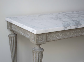
Now let’s style this Swedish Gustavian console table!
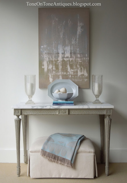
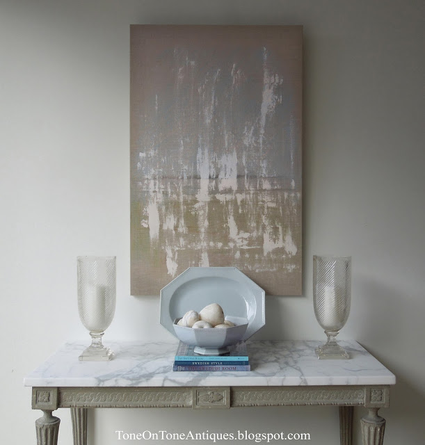
Vignette #1 – I styled this symmetrical vignette with antique blue creamware china appropriate for a dining or living room. On the console is a grouping of three, even though there are many individual items. A platter is layered behind the bowl, which is raised on a stack of books. The vintage Italian stone fruit add texture and invite handling, while the pair of hurricanes take the eye up to the abstract painting. Underneath is a tailored ottoman with an asymmetrically draped throw – both add softness. There is an overall color theme of blues.
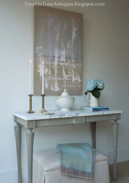
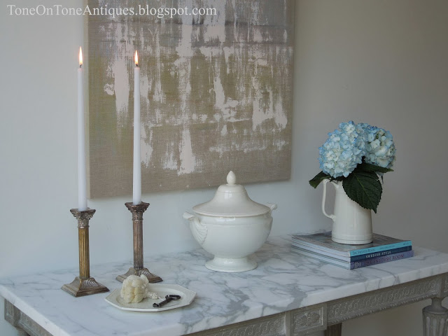
Vignette #2 – An asymmetrical but balanced vignette appropriate for the entry, living, and dining rooms. Notice the theme of creamware pieces, especially the little plate holding a key for, say, the front door, china cabinet, etc. In addition to being pretty, seasonal hydrangeas add freshness. Again, this is a grouping of three.
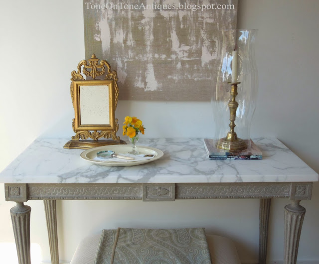
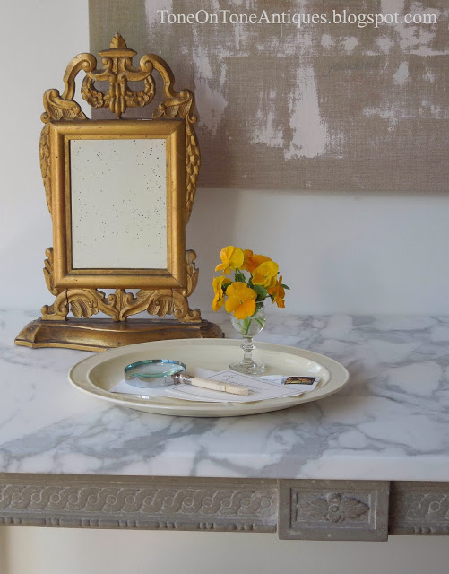
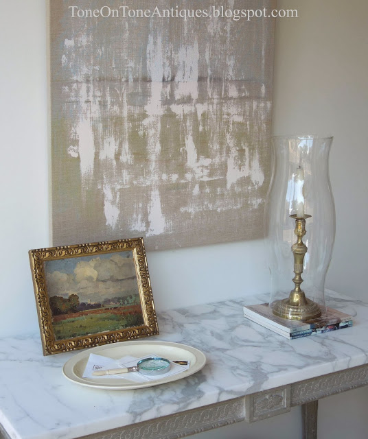
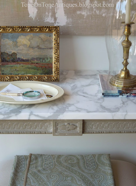
Vignette #3 – I envisioned this simple tableau for a foyer or entry hall. The grouping of two consists of a tall hurricane with candlestick, platter (or tray) to hold mail, and an antique dressing mirror for that last minute look before dashing out the door. Orange pansies in a tiny cordial glass are pretty while the antique magnifying glass is useful. Below is the same vignette except a small painting replaced the mirror. Instead of a painting, framed family photos would be lovely and personal.
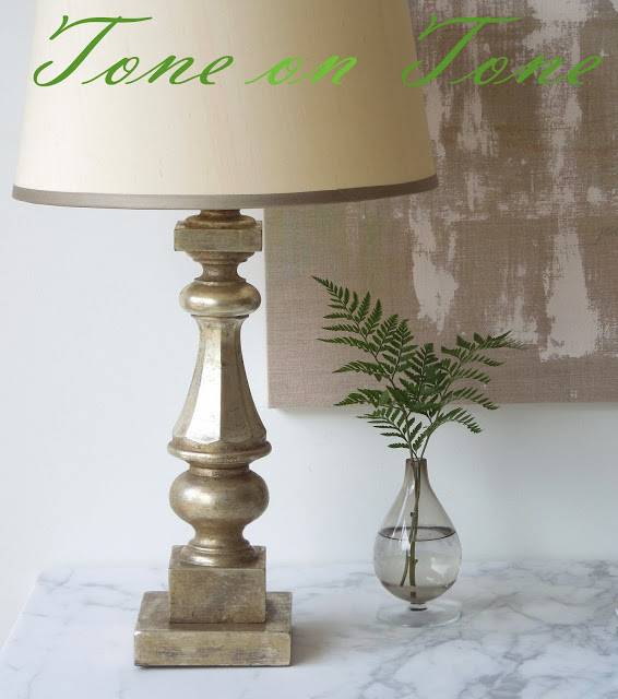
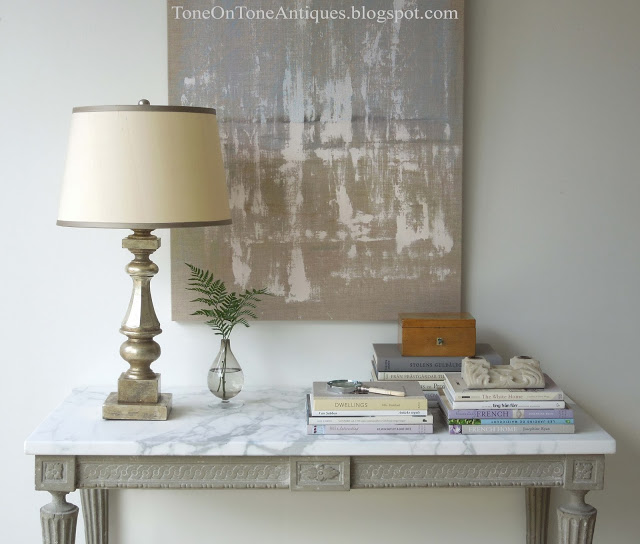
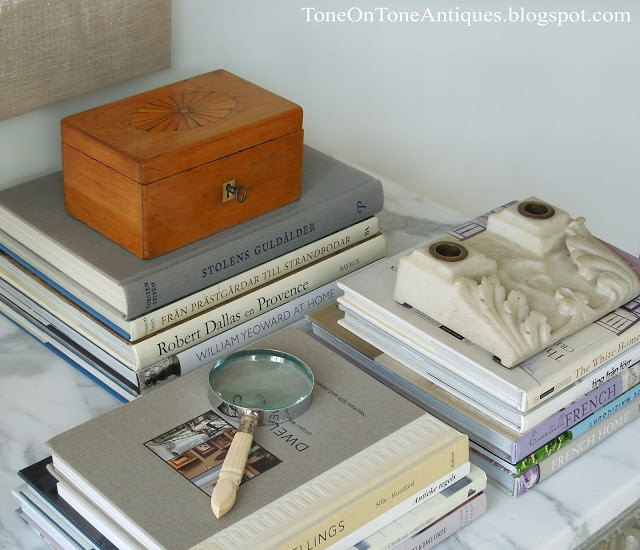
Vignette #4 – Here, the console is styled with the living room, library, and study in mind. Many items are neatly arranged in two asymmetrical clusters. The scale of the lamp is balanced by the visual weight of the books. On the books are complimentary accessories such as a marble inkstand, magnifying glass, and fruitwood box – all antiques! In lieu of flowers, ferns in a bud vase add an unexpected and organic touch. Flowers fade, foliage lasts.
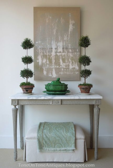
Vignette #5 – This last ensemble is simple and dramatic. From the flanking myrtle topiaries to the French tureen set to the paisley throw, it’s all about greens here! The topiaries take the eye way up while the unruly moss keeps them from being stiff and perfect.And that’s the conclusion of my first accessorizing post. Anyone want to buy the console? I’ll help style it!
Cheers,
Loi

this is such a fun series! i always love the look of symmetry but it's not for me- i like balance though. the one with the candlesticks and hydrangeas is the one that speaks to me the most and would most likely be found in my house!
I am hopeless when it comes to styling anything, but this is extremely helpful. Of course, I'm pretty sure anything on that amazing console would look great. Excellent post!
I love all the vignettes here!! I am all about books so I especially love that one! But that last one could be gorgeous as a simple Christmas green vignette.. all fabulous!! Have a wonderful weekend, Karolyn
These are all beautiful. Especially love the last one!
Dear Ashley – Thanks, and welcome! Is your first visit? Hope you'll come back 🙂
I love this post Loi!
Even though it looks effortless, it is anything BUT!
I struggle with vignettes, mostly when to stop as I have so much to work with. It can actually be a curse, rather than a blessing.
I think it is really about editing things down for the most impact and not crowding a bunch of great stuff together. It takes restraint… lots of it!
Thanks for sharing your talent as always…
Best to you my friend,
Terri
Is the green paisley throw for sale? How about the green tureen? You certainly have a knack for styling–it's a magnificent gift!
Thanks, M! The green tureen is actually from home, and the wool paisley throw is from De La Cuona.
Wonderful post again Loi! I so agree with what you said about respecting negative space, it's really hard to know WHEN to stop, but you masterfully showed it here. That console is fabulous piece indeed! Would love to have it someday!
Every single one of your vignettes were lovely, each respectful of their place and use. Oh my goodness negative space is so important! That Anichini throw is lovely. I had it in red at one point. My darn cats enjoyed it a little too much!
bravo. and MORE please. donna
Absolute perfection Loi – you are an expert, master and genius stylist. I love each and every vignette… tasteful, simple and restrained not to mention beautiful!! please if you ever come up to the Philadelphia area we have to meet! I am your biggest fan.
Thanks 🙂 And if you visit DC, let me know!!
Very helpful, Loi. I love #4 most. This is something I need to work on.
I love the moment, when creating a vignette, that you get the "all is right with the universe feeling", as you draw your hands back and sigh with contentment…or am I the only one who does that? LOL!
xo
Andie
I'm like that too…..that "Aha" moment!
Love the post, love the accessories, love the console. Very well thought out and explained.
Such great examples of restrained, beautiful accessorizing Loi! And the advice is really on point. I am in love with all of the vignettes and those throws…be still my heart!
xo Kat
This is a charming post! I love the last vignette the best, although I also love the one with the hurricane lamps. I have a similar Swedish console at the end of a hall, and I am constantly rearranging it. I need to find a nice tall vertical piece to hang above it – either a mirror or a piece of art. This post has given me a lot of inspiration!
Hope you have a great weekend.
– Holly
Oops, sorry, I meant the second to last vignette (with the lamps and the books). I recently pulled out my book 'Dwellings' as I was reading Stephen Sills new book Decoration. Isn't Dwellings a great book? It's so pretty too.
That is one of my favorite books! I have two copies: one at home and another at the shop.
Whoa!!! Love them all. I think #2 the best…or #5…I don't know. You are so TALENTED.
Loi-
This is such a beautiful post!! As always, perfection.
Happy weekend.
Teresa
xoxo
Great subject to write and educate about. The marble top on that table, is that even real? So gorgeous. Mother Nature wasn't _______ around when she made marble. Happy weekend to you both!
All are lovely, Loi. My favorite is # 4. I adore that simple, single fern cutting in that sweet little glass vase.
Claudia
As for me, I always start with symmetry and a theme as you also mentioned here. Then everything follows for me whether I want to add books or picture farms and some plants. You are a talented stylist Loi. Love all of your vignettes here. Have a wonderful weekend!
I believe vignette #3 is my favorite because of that shot of yellow from the flowers. But I would put the last-minute-glance mirror on the wall at eye level, because, after a certain age, no woman wants to look down at her face 🙂
Great post!
Love it all Loi! Wish I was there to help you play.
Great lesson, Loi. I love the one with the lamp and book stacks and the last one is my fave. I did a vignette lesson post the other day, too.
Very pretty – every one!
Hello Loi
Your keen eye and sense of scale and value makes all your vignettes winning combinations. I also love your repetition of pattern and colour
Have a glorious day
Helen xx
Well, you did it again.
Loi, you are magical, my friend. I think there is a structure and "poetry" to what you do, and do well. Beyond "well" really, is your craft because you incite a mood and a reaction with every vignette you make. Extraordinary isn't even the word I want to use, but let me just say that when I opened your page, I took a deep breath.
The grays we love really do lend themselves to the tones of blue AND green, don't they? It's as if gray was that undertone that exists in all colors and just brings out more of the primary colors or rather, subdues them. As much as I love the interior designs of the Twin Cities, we could really use some shops like yours here. HOW I ADORE YOUR STYLE…and most of all, you. What a fine human being you must be, to notice the small things, the larger objects, and bring them together to make beauty. Thank you my friend.
(I cannot wait to see what you are doing for the holidays!) Love, Anita
As always, many thanks, Anita!!! Talk soon, L
Dear Loi, love all the combinations on the console! You have such a good eye for all things beautiful!
Just gorgeous!
xx
Greet
Loi you have such a gift for displaying the most beautiful accessories with fine furniture.
xoxo
Karena
The Arts by Karena
Lovely lovely Loi: each one is just so beautiful. I have one small comment re. the mirror on #3. It would be awkward/difficult to use a mirror so low, even for a last minute "look see". While I love the mirror, I guess I would opt for something a little taller. Yikes, I hate to point this out, but you asked for suggestions(!) and have noted function and purpose! While I realize it's partly decorative, some height would make it pragmatic too! Hope I'm not out of line here…so let me know!
No worries, Libby. I appreciate your attention to detail. Actually the console is quite high….notice the height difference between the ottoman and it. Oh, the mirror can be picked up, too.
Gorgeous! And so helpful, I'm pinning pronto! They are all beautiful and the last one just does it for me, I rarely see green used that way and it's just stunning!
Dear Loi,
Bravo. I am a devoted fan. All the vignettes are perfect. And the last one with that glorious green color is my favorite. I do have a question – or maybe it's really a comment – when seeing articles, like lamps or bowls or accessories stacked on books I always think the designer could not find the correct size lamp or accessory so he stuck it on books to bring up the height. At the same time I also feel it is such an insult to the books. The books are objects in themselves and to use them as props reduces their worth from what is contained on their pages to mere objects. I know I sound cranky but homes are not theatre sets. I love your vision on bringing objects for the home or garden together. Thanks.
Loi – some people have a knack of assembling objects so that they compliment each and look right, other don't – but you have that magical gift.
Bravo. Helpful tips. I like all your vignettes but prefer balanced asymmetry.
perfectly curated as always Loi 🙂 Vignette #3 with the small painting and #4 with the design books are my favorites. fyi… I added another design book to my collection this week-if you don't already have it- White Light by Heiberg & Cummings Design- fantastic! I'm off to an antique fair today- yes, still looking for several things for the barnhouse :)! Have a great weekend-
XO Sarah
Oh, I will put that book on my holiday wish list 🙂 Thanks, Sarah!
Loi, this Post is PRICELESS!!!
There is so much to learn! Wonderful, useful and understandable advice!!!!!!!
Will keep it as a Go To for the future!!
Thanks so much
xo
Patty
Love, love, love! Thanks for explaining!
Hello Loi, The first symmetrical pattern interestingly has its rigid symmetry softened by the slight asymmetrical piling of the stone fruit and by the angle of the fringed cloth.
Although you used established design principles for each of these vignettes, they are not only original, they also carry the unmistakable Loi Thai stamp. I think that it is mostly a gift. When I try to make such arrangements I usually end up with a hodge-podge, but next time I will follow your advice, and see if I can't improve.
–Jim
Thank you, Jim. Hope you'll share your vignettes with us!
You make it look so easy, Loi. I love 4? with the stacks of books and the wood box. Although, the one with the topiaries are a close second.
Dear Loi, I love what you've done, and all the vignettes look great. I think the most important rule (in that it's very often is not followed), is that such tablescapes do need to include something of height.
Hi Loi,
I'm so glad your friend suggested such a post! Your advice is spot-on, and I'm guilty of not knowing when to stop quite often. I know what you leave out is just as important as what you put into a vignette, maybe even more so. Love that painting, too! Please keep doing more of this kind of post – you have such great style.
-Revi
Loi…… lovely vignettes and your advise is right on! Love the topiaries…
Great styling advise, Loi. Ya know… it's funny, but styling and furnishing a room are two different things and it's not as easy as it looks, but these are great tips and some I'd never thought of before. I love all of the vignettes, but if I had to choose one, the last one kinda knocked my socks off! Thanks, too, for your lovely comments on my blog! xo
i love attending vignette class at tone on tone school, loi. thanks for the lesson and the creativity–your eye is so trustworthy!
happy weekend.
michele
This is the next best thing to visiting your gorgeous Tone on Tone in person!
Wonderful post, Loi.
You are so generous to take the time to share your talent and inspiration.
I like the ottoman underneath the console.
I also like the idea of neatly stacking your books. Not only are they beautiful, but they also put your books in a place where you can see and use them.
xo
Brooke
Thanks, Brooke! Look forward to you visiting again…..hope it will be soon!
Hi Loi – Every example you've shown is beautiful and versatile. I would take them all (if I could!), but I was especially drawn to the last one with the greens. The French tureen makes me want to buy a few green majolica plates. So pretty!
xo,
Deborah
Uber-stylish. Wonderful tips. Beautiful images. That last one, though–topiaries get me every time! XOXO!
Loi you have it! It's like color, some have it and some don't. Beyond symmetry and balance I like that your choice of items to use are those that are not just what happens to be de riguer . For example simply using an object because it displays an Ikat or chevron pattern. It (my opinion) is much more satisfying to use things we actually hold important – a collection, a sentimental item, a souvenir from a memorable trip, even something that we find aesthetic because of it's color. I don't mean to say that we should not appreciate current trends but I feel tht using other things in the mix creates a more personal and interesting style.
Thahk you Loi for your always interesting posts.
Thank you! Many of the accessories are actually from my personal collection. I used them to illustrate certain points.
Highly inspiring!!
My favorite vignette: Number 5. Simply perfect!
Happy Sunday dear Loi,
Greetings from the Périgord, karin
The last 2 speak to me! Personally, I would have a painting with a dash more colour in the last pic…
Lovely!
love this post + knowing what to leave out is just as important as knowing what to put in + you have such a touch + thanks for leaving such a sweet comment on my blog. xxpeggybraswelldesign.com
Hi Loi, Fantastic Post!! Now I'm learning the ABC's–it helps to know why it works and why it doesn't. I'd love to have the table just to have your wisdom walk in my shop's door.
xoxo
Mary
Hi Loi,
I love them all but the green tureen and topiary might be my favorite. This is a favorite topic and I really appreciate the list of suggestions as I'm always changing things on my own tabletops and shelves. Thank you.
xo,
Karen
Thank you – I love your blog – greetings from Vienna!
I would love to buy the console. But my favorite part of all is your exquisite taste and that is sadly not for sale! Every vignette is gorgeous and so instantly "Loi". I noticed when I first started trying to style my vignettes that one needs to have a good selection of pretty 'objets'. It took me a while to collect enough interesting things…but I still can't style as cooly and elegantly as you. I think you nailed your style best when you mentioned negative space. I always feel like your vignettes are perfectly edited. Most people don't seem to know when to stop…!
xo's Terri
brilliant Loi. Love the artwork…the juxtaposition of abstract and traditional painting my favorite.
You're the master and I bow to you, dear friend! I am a lover of asymmetrical style but I do love the topiaries and the blue creamware. I love the ottoman with that throw on it underneath the console. Hope you're having a great weekend and staying cozy this damp, gray day. Have a wonderful week!
xo Nancy
You know I love you and I love anything you do! Anyway you were to style a console would be pure perfection for me! I certainly understood when you said you needed to style a piece in order to let the customers envision it every way possible! ( of course, you stated it more eloquently!) Anyway, your style is impeccable and I would love your input on how to re-style my shop any day! And I'm so glad you finally made your confession about Luke! Lol! Thanks for all of your sweet comments and emails! I truly appreciate you and your friendship!
Beautiful, simple and exquisitely photographed.
Wonderful suggestions. I love hearing your inner-designer views.I am looking for a pair of consoles or benches for my entry way, if you have any please let me know.
Very good idea Loi ! to share us all of the "mises en scène" with the gustavian table ! My favorite is the last one, I love symmetric…
Have a nice day !
Céline.
Hi Loi,
Your vignettes are all beautifully styled, each one for a different purpose, meant for a different space, as you say. What they also have in common, and I believe this is the clincher, is IMAGINATION! Yes, creativity that springs from a vision, and flows into a practical reality. For me, editing is just as important, and makes the difference between a pretty space and an intriguing one. My favourite is #5, for its drama, simplicity, and symmetry. It could easily be an oil painting on canvas, forever to be admired and enjoyed.
Wishing you a lovely week!
xo
Poppy
Beautiful as always….can't chose a favorite 🙂
Dang it…dang it…..such control with your styling…I need to take a lesson! I am trying to pick a fav. #1 and #4…but wait….#2 is awesome….but wait #3 and #5 are killer. Oh hell #6 is….wait there is no #6. Love them all.
Oh my, Loi! You are incredible. These vignettes and styling tips are straight out of a magazine. Actually, they are better than most of what's out there. You've also shown the importance of starting with quality pieces in neutral colors. You can take them in any direction.
You know I want that console. But, most of all, I wish you would come and style my home. I have a feeling, we might be clearing off some surfaces! lol!!
xoxo Elizabeth
Hello Loi,
What a helpful post. I love how you included 5 examples with different color schemes to teach us how to create a beautiful vignette. I am sure to use this technique in my home thanks to you! Beautiful work!
Susan xxoo
Thank you for this great post, Loi! I love your green tureen, so beautiful.
I will restyle my console per your tips! Berta
Three words, BOOK, BOOK, BOOK!
Please tell me you are going to get a book published containing all your beautifully inspired interiors and gardens Loi.
I know it would be hugely popular.
I love all your vignettes but number 4 with the fern is my favourite. I love the lightness of air it lends the weighty objects on either side, lovely!
That was way more than three words wasn't it……oops!
What a timely post Loi!
Now, can you please come quick?!?
I have a rustic period pine hutch in my dining room that has always been home to a couple of patterns of fine china. Now the dining room is my office/library. The china is sadly out and the design books are in. Would love your "visual" suggestions on how to combine a bit of both. I also have collections of pewter, hand painted Italian dinnerware and majolica (my oh my) that I can choose from! I'll keep watch for your next post in the series. Meanwhile I'm heading over to your pinterest to have a look. Loi you are so good. Every time I visit, I leave inspired and a bit wiser.
Thank you. Your styling today on the console is stunning in such an approachable and welcoming way.
All the best,
Lisa
I've tried to select a favorite, and I think it has to be the arrangement with the topiaries. I guess the green is particularly appealing this time of year, as that color starts to disappear outside. Thank you for these great ideas, actually this post is a handy check-list!
Happy Thanksgiving, Loi!
Suzanne
I love everything about this post! Love seeing your creativity take off in so many different directions. {And yes, love the console and your kind offer to style it!} Interesting to reflect on which vignettes I'm drawn to at this stage in my life. I used to be much more orderly and dare I say "in control," so I would be drawn to #5 then. But these days, I'm really drawn to the more casual, loose yet thoughtful feel of asymmetrical vignettes, especially 2 and 5. Isn't interesting to see how different styles reflect our lives in different stages or seasons? Blessings to you as always!
Dear Loi,
A very interesting and informative post! I do like the effect of the fern leaves in the bud vase.
One thing that I do like is the way the books are stacked: not too many so that they become a forbidding pile. To my mind, there is nothing worse than seeing a tall pile of books and spotting one book near to the bottom that you feel you might like to read but are then put off by the fact that there are so many balanced on top of it.
Bye for now,
Kirk
Loi…you.are.the.best. !!
Loi, I love this post. I have a beautiful but very empty console in my living room. You've inspired me.
Keri
Ha! I WISH!! 😉 It would be perfect in my entry, Loi! You have such a gift….thank you so much for generously sharing your secrets. (I am eagerly awaiting you book…hint, hint)
Beautiful vignettes….every one….many gorgeous ideas here….
Well, I know what you mean re:the days getting darker sooner….only naps and food can satisfy those doldrums.. 😉
Thank you so much for the inspiration, dear friend….
Much love,
– Irina
Very nice! That painting is beautiful and soothing.
Stunning furnitures and fixtures, great photos by the way.
http://www.facebook.com/designlit
http://www.twitter.com/designlit
http://instagram.com/designbelitup
http://pinterest.com/designlit
Very cool, Loi. So many different items used, yet you stuck to your rule of three. Really loved the abstract painting juxtaposed with varying antiques. And I loved the ottoman under the console and your soothing colors. Nice break from all the red and green approaching.
b
Loi, I hope you have a wonderful weekend! Enjoy the beautiful weather and perhaps a little rest.
Loi, these are terrific tips and beautiful examples. Happy Weekend!
Your vignettes are masterful! So wonderful that your used the same console table and creatively styled differently. I love your detailed explanations.
Beautiful vignettes Loi!! Your tips are very helpful and you make everything look so easy .. even though (for most of us) it's not;) I like your style and appreciate the lack of clutter, and simple elegance of Swedish decor. xxleslie
Hello Loi,
Beautiful and inspirational as ever! I shall be put your advice into practice! Hope you are both well.
Best wishes Ivan x
Hi, Loi! I tried to decide which was my favorite, but I gave up. I love how everything is so carefully and seemingly effortlessly edited. Your style is so concise and so beautiful. I hope you are well and getting ready for a lovely Thanksgiving week.
Loi, I hope that you are braced for the bad weather coming this direction. I hope that if you are traveling, you travel safe and if you stay in town that you are surrounded by family and friends on this wonderful Thanksgiving.
Take care, Elizabeth
dearest loi
my breath left me in an audible gasp gazing at your artistry………oh my! i am partial to your first and last ensemble however all are alluring. many thanks for sharing your insight loi, to grasp but a bit of a genius is a tremendous gift. kudo's……
your grateful fan
debra
BEAUTIFUL LOI!
How nice of you to stop by after coming home from being away! You are just the loveliest human being. LOVE! I hope you had a great time off/hunting and gathering trip? Are you getting your fabulous home ready for the holidays yet? I am trying to go all gray and white but there are still so many dark elements in the house that don't allow for that feeling YET! But I'll get there. I'm having fun trying!
May you and Tom enjoy some quiet time before the festivities begin; I suspect you are going to have a fun and family-filled time!
HUGS, Anita
Happy Thanksgiving.
You always share such beauty.
Thank-you.
pve
Gorgeous styling!
http://roomsofinspiration.blogspot.com/
Hello Loi,
Beautiful and inspirational as ever! I shall be put your advice into practice! Hope you are both well.
Great post Loi. I have always leaned towards a symmetrical look, just must be the Virgo in me. However, I'm trying to push my comfort zone and create asymmetrical looks. Sometimes it's just a happy accident when I get it right. I love all your vignettes, but #5 is the one that still speaks to me. I love the topiaries and tureen.
Congratulations on your beautiful new home. What a charming setting!
What a lucky house!
Lisa in Charlottesville
Hello Loi; Wow-how many loyal fans you have! I am a Decorator/Stylist as well (different age bracket) and I have always loved the Swedish/Gustavian style-discovered when I went to Sweden and Finland in the 1970's. I also used to work for Marimekko early in my career, and yes the 2 countries, although next to each other have very different Design Aesthetics. So my favorite is #1 photo, very Swedish for me and I love your color selection. They are all lovely however. Is the throw an Anichini product? My sort of personal signature color, would be fab. in my bedroom. I hope it is possible to follow you. Best Regards, Winona
THIS QUICK QUESTION: Are the 'myrtle topiaries' real or fake ?